Insights
Design Tips for Non-Designers.

Design Tips for Non-Designers
These days, as we are bombarded with information, visual communication is an opportunity to condense information and catch the attention of audiences. Even if you don’t have a graphic designer on staff, it’s possible to create clean and professional designs that enhance your messaging.
 Start with a mood board.
Your design should be cohesive throughout, so start with a mood board. After locking in the goals and audience for the project, collect imagery, typography, themes, and colors that align with your goals. These images aren’t actually used in your design (often for copyright reasons) but should inspire your end product and process. If your organization has a previously established style guide, use that instead.
Start with a mood board.
Your design should be cohesive throughout, so start with a mood board. After locking in the goals and audience for the project, collect imagery, typography, themes, and colors that align with your goals. These images aren’t actually used in your design (often for copyright reasons) but should inspire your end product and process. If your organization has a previously established style guide, use that instead.
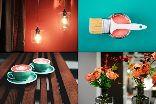
 A picture is worth a thousand words.
Use high-resolution, royalty-free or properly paid imagery to keep your work clean and professional. If you want to add more interest and break up the copy, consider using icons. When using icons, be sure that they are consistent—you don’t want to have icons of different sizes, styles, and stroke weights.
A picture is worth a thousand words.
Use high-resolution, royalty-free or properly paid imagery to keep your work clean and professional. If you want to add more interest and break up the copy, consider using icons. When using icons, be sure that they are consistent—you don’t want to have icons of different sizes, styles, and stroke weights.
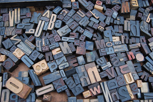 Let your fonts send a message.
The right font can define the mood of your piece. Typography is an in-depth study but 99designs goes over the basics well in this article. To put it simply, there are 5 different types of fonts: serif, slab serif, sans serif, script, and handwritten fonts. Each of these fonts will subconsciously communicate a different message and feeling to your viewer. Serif fonts are stable; they immediately give the piece a serious and trusted tone. Slab serif fonts—which are usually very large—grab the viewer’s attention, so they should be used sparingly. Sans serifs are fonts without the serif strokes. These are typically used to communicate a modern, clean aesthetic. Script fonts instantly give your work a more elegant or historical aesthetic. Finally, you have the handwritten font. Handwritten fonts are used in almost every kind of design.
Let your fonts send a message.
The right font can define the mood of your piece. Typography is an in-depth study but 99designs goes over the basics well in this article. To put it simply, there are 5 different types of fonts: serif, slab serif, sans serif, script, and handwritten fonts. Each of these fonts will subconsciously communicate a different message and feeling to your viewer. Serif fonts are stable; they immediately give the piece a serious and trusted tone. Slab serif fonts—which are usually very large—grab the viewer’s attention, so they should be used sparingly. Sans serifs are fonts without the serif strokes. These are typically used to communicate a modern, clean aesthetic. Script fonts instantly give your work a more elegant or historical aesthetic. Finally, you have the handwritten font. Handwritten fonts are used in almost every kind of design.
 Hierarchy can make or break your design.
Hierarchy, as 99designs describes it, is “the arrangement of graphic elements in a design in order of importance... communicating to a viewer’s eyes what to focus on and in what order.” Most people scan things before they decide whether or not to engage with them. A good hierarchy recognizes that and is designed to encourage interaction through sizing and layout. Bigger things will be read first and considered more important—from there, you can use color and contrast to direct the viewer’s attention. Focus on your basic typographic hierarchy by using 3 levels: Headline, subheadline, and body copy. Give your design room to breathe and structure it in a way that makes sense visually. Do not put the most vital information at the end and do not highlight information that is not very important—too much emphasis throughout your piece will ultimately ruin the hierarchy and confuse the viewer.
Hierarchy can make or break your design.
Hierarchy, as 99designs describes it, is “the arrangement of graphic elements in a design in order of importance... communicating to a viewer’s eyes what to focus on and in what order.” Most people scan things before they decide whether or not to engage with them. A good hierarchy recognizes that and is designed to encourage interaction through sizing and layout. Bigger things will be read first and considered more important—from there, you can use color and contrast to direct the viewer’s attention. Focus on your basic typographic hierarchy by using 3 levels: Headline, subheadline, and body copy. Give your design room to breathe and structure it in a way that makes sense visually. Do not put the most vital information at the end and do not highlight information that is not very important—too much emphasis throughout your piece will ultimately ruin the hierarchy and confuse the viewer.
 Embrace negativity.
Negative space is the space between, within, and around the subject of an image. Negative space can define boundaries and balance your piece. Most designers use negative space to create additional imagery and communicate their message. Negative space can also give your piece room to breathe. Oftentimes, people are so focused on squeezing as much information as possible into one design, but crowded pieces overwhelm readers.
Wrap-Up
Now that I have put myself out of a job, I leave you with this: the art of graphic design encompasses way more than a few tips can manage, but this information will help you create simple designs that effectively communicate your message and achieve your goals. They will help you create quality work in a pinch and give you the confidence to know what to ask for when you do work with a graphic designer.
Embrace negativity.
Negative space is the space between, within, and around the subject of an image. Negative space can define boundaries and balance your piece. Most designers use negative space to create additional imagery and communicate their message. Negative space can also give your piece room to breathe. Oftentimes, people are so focused on squeezing as much information as possible into one design, but crowded pieces overwhelm readers.
Wrap-Up
Now that I have put myself out of a job, I leave you with this: the art of graphic design encompasses way more than a few tips can manage, but this information will help you create simple designs that effectively communicate your message and achieve your goals. They will help you create quality work in a pinch and give you the confidence to know what to ask for when you do work with a graphic designer.
Start with a mood board.
Your design should be cohesive throughout, so start with a mood board. After locking in the goals and audience for the project, collect imagery, typography, themes, and colors that align with your goals. These images aren’t actually used in your design (often for copyright reasons) but should inspire your end product and process. If your organization has a previously established style guide, use that instead.
A picture is worth a thousand words.
Use high-resolution, royalty-free or properly paid imagery to keep your work clean and professional. If you want to add more interest and break up the copy, consider using icons. When using icons, be sure that they are consistent—you don’t want to have icons of different sizes, styles, and stroke weights.
Let your fonts send a message.
The right font can define the mood of your piece. Typography is an in-depth study but 99designs goes over the basics well in this article. To put it simply, there are 5 different types of fonts: serif, slab serif, sans serif, script, and handwritten fonts. Each of these fonts will subconsciously communicate a different message and feeling to your viewer. Serif fonts are stable; they immediately give the piece a serious and trusted tone. Slab serif fonts—which are usually very large—grab the viewer’s attention, so they should be used sparingly. Sans serifs are fonts without the serif strokes. These are typically used to communicate a modern, clean aesthetic. Script fonts instantly give your work a more elegant or historical aesthetic. Finally, you have the handwritten font. Handwritten fonts are used in almost every kind of design.
Hierarchy can make or break your design.
Hierarchy, as 99designs describes it, is “the arrangement of graphic elements in a design in order of importance... communicating to a viewer’s eyes what to focus on and in what order.” Most people scan things before they decide whether or not to engage with them. A good hierarchy recognizes that and is designed to encourage interaction through sizing and layout. Bigger things will be read first and considered more important—from there, you can use color and contrast to direct the viewer’s attention. Focus on your basic typographic hierarchy by using 3 levels: Headline, subheadline, and body copy. Give your design room to breathe and structure it in a way that makes sense visually. Do not put the most vital information at the end and do not highlight information that is not very important—too much emphasis throughout your piece will ultimately ruin the hierarchy and confuse the viewer.
Embrace negativity.
Negative space is the space between, within, and around the subject of an image. Negative space can define boundaries and balance your piece. Most designers use negative space to create additional imagery and communicate their message. Negative space can also give your piece room to breathe. Oftentimes, people are so focused on squeezing as much information as possible into one design, but crowded pieces overwhelm readers.
Wrap-Up
Now that I have put myself out of a job, I leave you with this: the art of graphic design encompasses way more than a few tips can manage, but this information will help you create simple designs that effectively communicate your message and achieve your goals. They will help you create quality work in a pinch and give you the confidence to know what to ask for when you do work with a graphic designer.